


Hey guys. I designed a few t-shirts and am hoping to get some feedback on them. Positive, negative, I'll take it all.
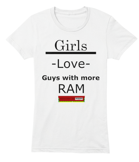
https://teespring.co...s-with-more-ram
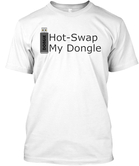
https://teespring.co...tswap-my-dongle


Bit
Posted 24 August 2016 - 03:33 PM
Hey guys. I designed a few t-shirts and am hoping to get some feedback on them. Positive, negative, I'll take it all.
https://teespring.co...s-with-more-ram
https://teespring.co...tswap-my-dongle
Ascended Prophet
Posted 25 August 2016 - 10:12 AM
The first one has a bit too much going on with the hyphens and underline and such. Second one's all right.
Forever in debt to your priceless advice.
Posted 25 August 2016 - 10:54 AM
I feel like multiple fonts on the first (ie: "Love" in script), more interesting font on the second, and more phallic placement of the ram and dongle would improve them both substantially.
ΝΙΨΟΝ ΑΝΟΜΗΜΑΤΑ ΜΗ ΜΟΝΑΝ ΟΨΙΝ

Tentacular!

Posted 25 August 2016 - 11:20 PM
I feel like you're trying way too hard to make 'lol dick jokes' into shirts.

“Shimatta! Bare… nan no koto kashira?”
Bit
Posted 06 September 2016 - 11:34 PM
Hey, Penis jokes sell...
I think your biggest issue is the font. It just fails to catch my eye ya know?
Otherwise, I like the second one, the graphic size matches up well with the phrase size. That being said, I'd play around some more with the first shirt. Love the idea of it but I think that the graphic looks more like an afterthought to the shirt. Small and just stuck in there.... unless that's the kinda RAM you're going for 
Maybe play with the fonts and the spacing, not so center column aligned. Mix it up. And rethink the RAM graphic. I love the phrases though, dirty tech jokes can't be wrong  it's just a matter of making them work layout wise. if you get the right look going for them the idea of the shirts could be golden.


